

OTOBO Customer Portal
Re-designed from scratch
Uncluttered, up-to-date, easy to use
For the OTOBO GUI overhaul, we took the UI/UX experts of Munich Brand and Design Agency SANMIGUEL on board. As a first step, we entered into a complete re-design of the OTOBO customer interface. Here, the need for action was most acute - and the gain in usability is most immediate, too.
Our goal was to create a modern, clean interface. Thought out to the last detail, uncluttered and truly intuitive. We were striving for a great optic but also and above all for the best usability. We minimised click paths, implemented a new dialog-based form design, reduced the design again and again and obviously thought about your mobile users, too. Another focus point: maximum flexibility, to be able to cater to the most various requirements. The result is a an intuitive app with light and clear optics, making even large amounts of information easy to comsume for the users.
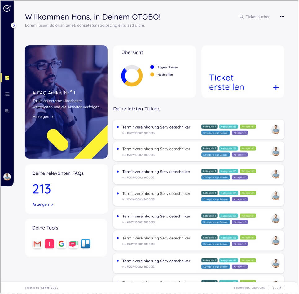
OTOBO Dashboard
All relevant information at a single glance
The Dashboard is the central hub of the new interface. It is the one point of reference, where users find all relevant functions and information at a single glance.
Flexible tiles provide a basic structure, in which various elements and information can be configured and arranged freely. This provides maximum flexibility and clear and uniform optics at the same time.
The following elements are available:
- FAQ Module – incorporate a link to the FAQ Module as a whole or to selected FAQ articles and instructions
- Ticket Overview – access to all current tickets of a user, categorised with coloured tags
- New Ticket – Create new tickets directly from the dashboard
- Message of the day – displays individual notification texts
- Statistics – showing selected statistics in various display modes
- Links to external tools / resources
- Image / graphics tiles


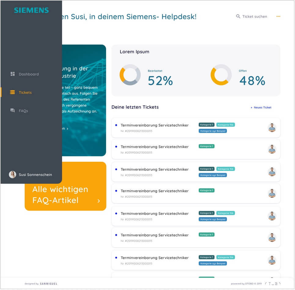
OTOBO Tickets
Modern, compact and efficient
The Ticket Overview provides a compact overview of all tickets of a user. Optical markers show ticket states and categories at a single glance.
Filter and sorting functions and a highly efficient ticket search functionality based on Elasticsearch help to to stay on top of things.
Additionally to the new clean design boiled down to the relevant elements, we have streamlined processes, too. Customers can create new tickets and close tickets from their Ticket Overview with a single click. And the new dialogue-based forms take users by their hands so that they won't feel overwhelmed even when there are many fields to complete. This makes sure your service team has all the info they need to help right at their fingertips. By and large the greater ease of ticket handling facilitates more efficiency and thus greater satisfaction – for clients and team.
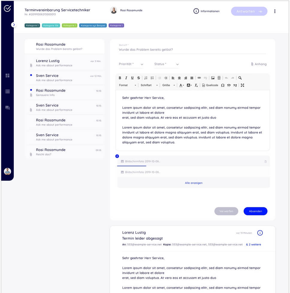
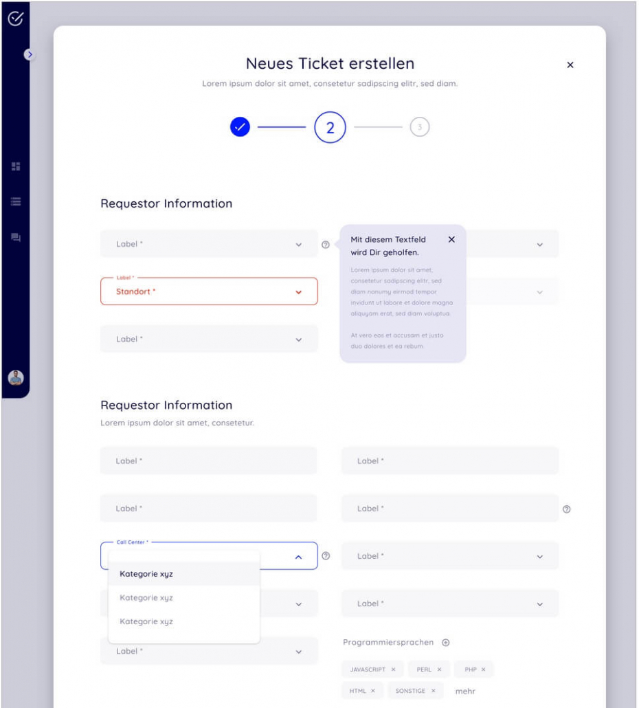
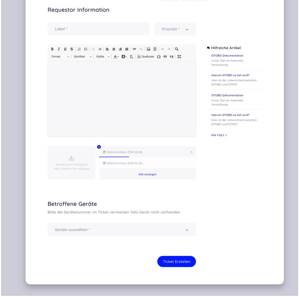
OTOBO forms
Complex ticketing made easy
Forms are one of the most important features of ticket systems - at the same time they are one of the most ambiguous. Smart forms make sure your service team have all the info they need to help at their fingertips. In an ideal world, they save everybody precious time. In reality, too often they are so complex that customers end up picking up the phone again instead of creating a ticket themselves, or send it off half-completed.
That's why clever design and clean optics are game changers when it comes to forms. We have completely re-designed the ((OTRS)) Community Edition's form functionality and added features such as multi-columns forms, field grouping, subheadings and enhanced Hide/Show functionality.
Creating tickets is really easy in OTOBO. Even with complex forms, and large numbers of fields and interdependencies. Based on the information given all relevant data for the next processing step are requested - dynamically and step-by-step. Tool tips give support, where customers find completing the form difficult. The result ist a win-win situation: No time wasted for redudant further inquiries, quicker results - happy customers and more time for your team.
